


333 Seymour St.
Vancouver, BC


The challenge was creating a sophisticated identity that distinguished North + Oak in the traditionally masculine construction industry while authentically representing their environmental mission and "slow living" philosophy that resonated with their target audience.
Working directly with founder Celena Aujla, we identified emerging trends in architectural and builders' design, discovering that "slow living" themes strongly connected with their core demographic. Research revealed an opportunity to differentiate through neutral palettes and softer aesthetics that reflect both the natural British Columbia landscapes where they develop and the female-led company's approachable philosophy.The strategy focused on creating visual components that complement sustainable living values,using natural colour palettes derived from BC's environment while ensuring the brand system would work consistently across all applications on light, neutral backgrounds.
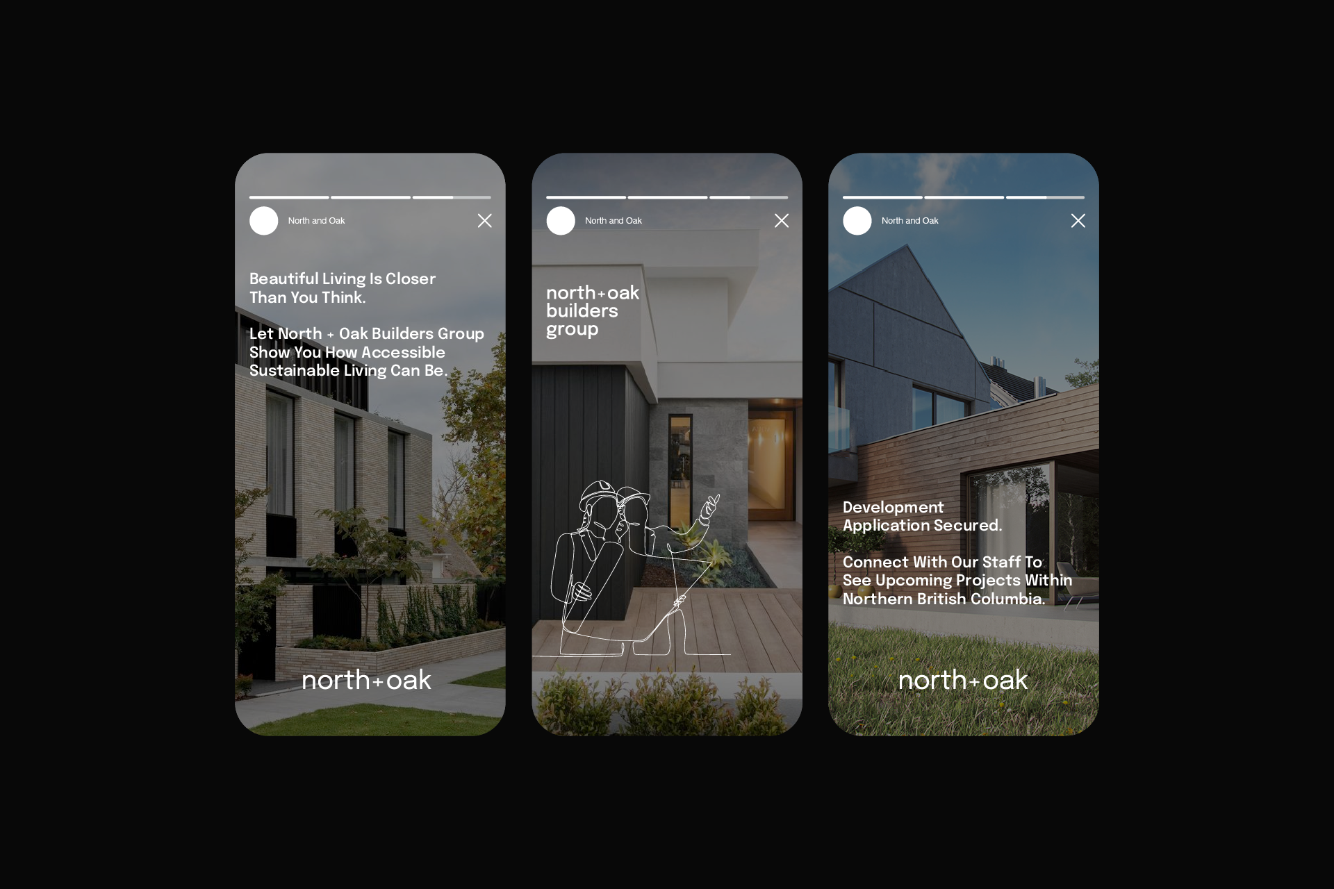

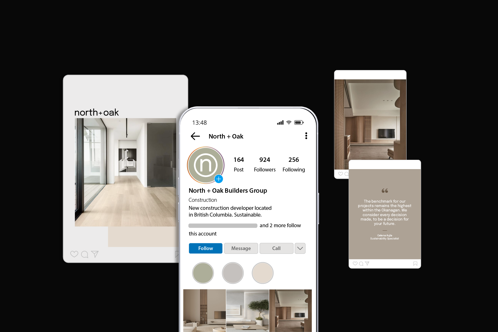
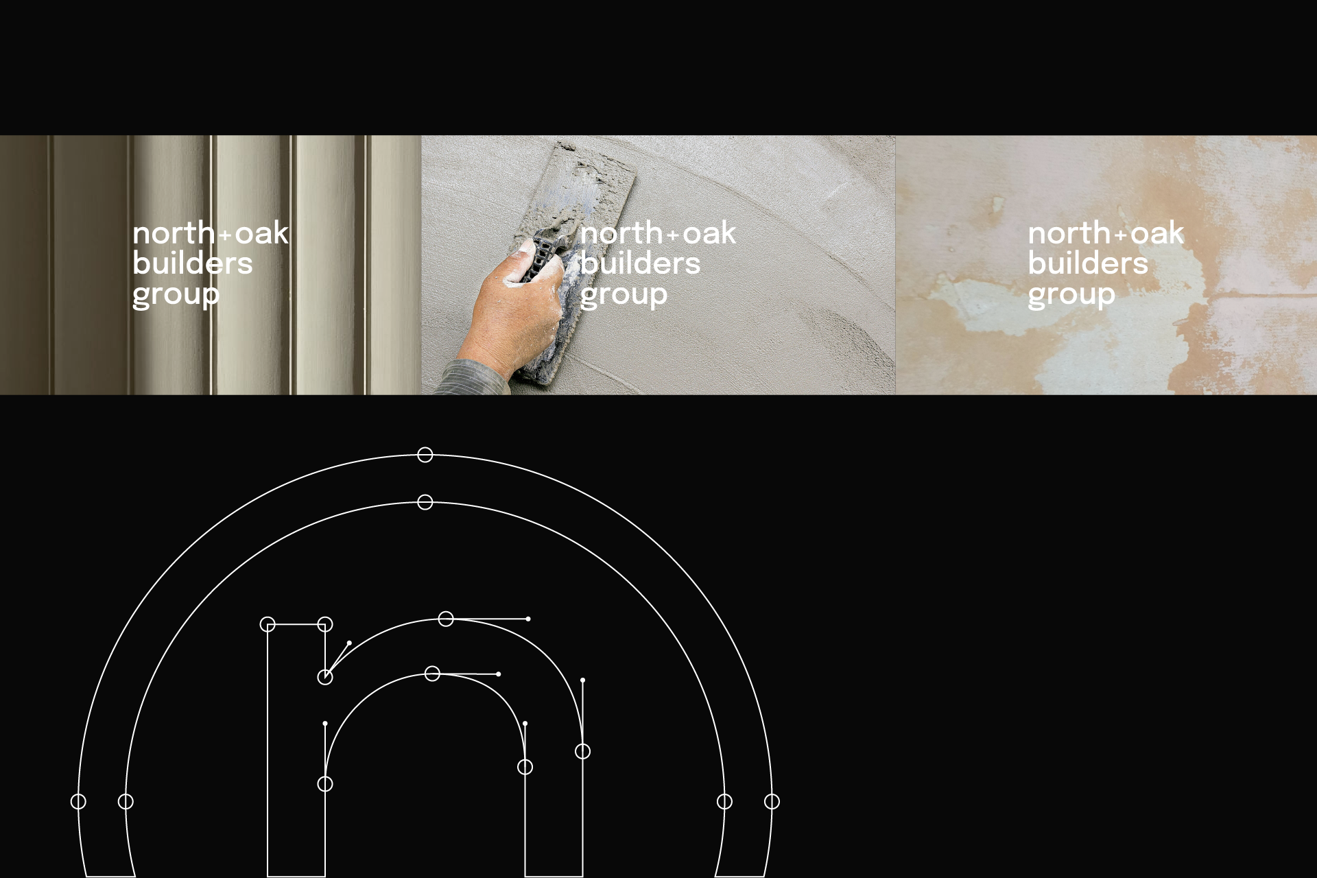
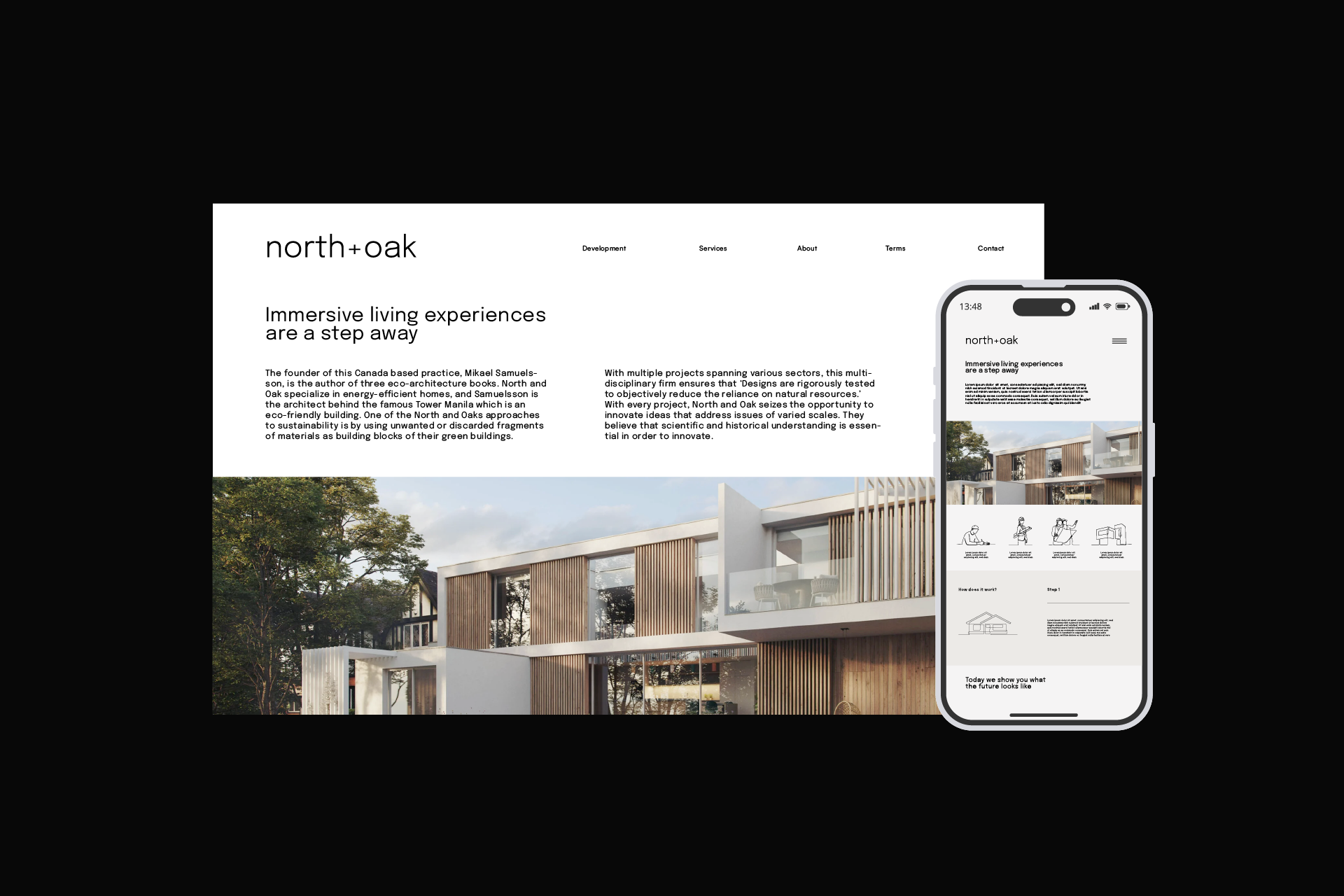
Visual Identity System: Developed a clean, minimalist brand architecture featuring a sans-serif wordmark "North + Oak Builders Group" paired with a distinctive lowercase "n" within a circle icon for smaller branded applications. The design philosophy emphasized simplicity, allowing the quality of their sustainable construction work to speak for itself.
Natural Colour Palette: Selected warm, neutral tones inspired by British Columbia's natural materials—softer versions of colours found throughout the province's landscapes. The palette deliberately departed from typical construction industry branding, creating an inviting,approachable aesthetic that resonates with environmentally conscious home buyers.
Brand Applications:
Visual Storytelling: Developed photography direction featuring interiors with soft fabrics, eco-conscious design choices, and natural wood elements that authentically represent the slow livinglifestyle and sustainable building philosophy.Brand Integration: The identity system was designed for seamless application across touchpoints, maintaining visual consistency on white and light neutral backgrounds while providing sufficient contrast for professional presentation across all media.
Creative Impact: The branding resonated so strongly with the target demographic and founder that Celena Aujla adopted the aesthetic for her personal professional brand, incorporating the colour palette and visual approach into her clothing choices, construction site photography, and LinkedIn professional presence—demonstrating authentic alignment between brand identity and personal values.
Project Outcome: Successfully launched North + Oak Builders Group in Fall 2023 with a distinctive market position that differentiated the company through sophisticated,environmentally conscious branding in the traditionally masculine construction industry.