


333 Seymour St.
Vancouver, BC

GSL Group contracted Go2Ventures (now Stories Inc.) to develop market positioning, competitive analysis, and complete brand identity for OPBets—a Canadian-owned sports betting platform designed to capture market share through authentic Canadian positioning and community-focused values. The project required navigating complex regulatory restrictions while maintaining user trust and differentiating against well-funded international competitors.
Strategic Market Research & Competitive Analysis: Conducted comprehensive competitive landscape analysis across three competitor categories: direct competitors (Bet365, FanDuel, Pro-line, DraftKings), indirect competitors (BetWay, BetOnline, BetVictor), and breakthrough threats (SBet/Sportsnet). Analysis included demographic popularity assessment, marketing focus evaluation, and touchpoint identification to uncover market positioning opportunities.
Customer Segmentation & Persona Development: Developed three detailed customer profiles with complete demographic, psychographic, and behavioural characteristics:
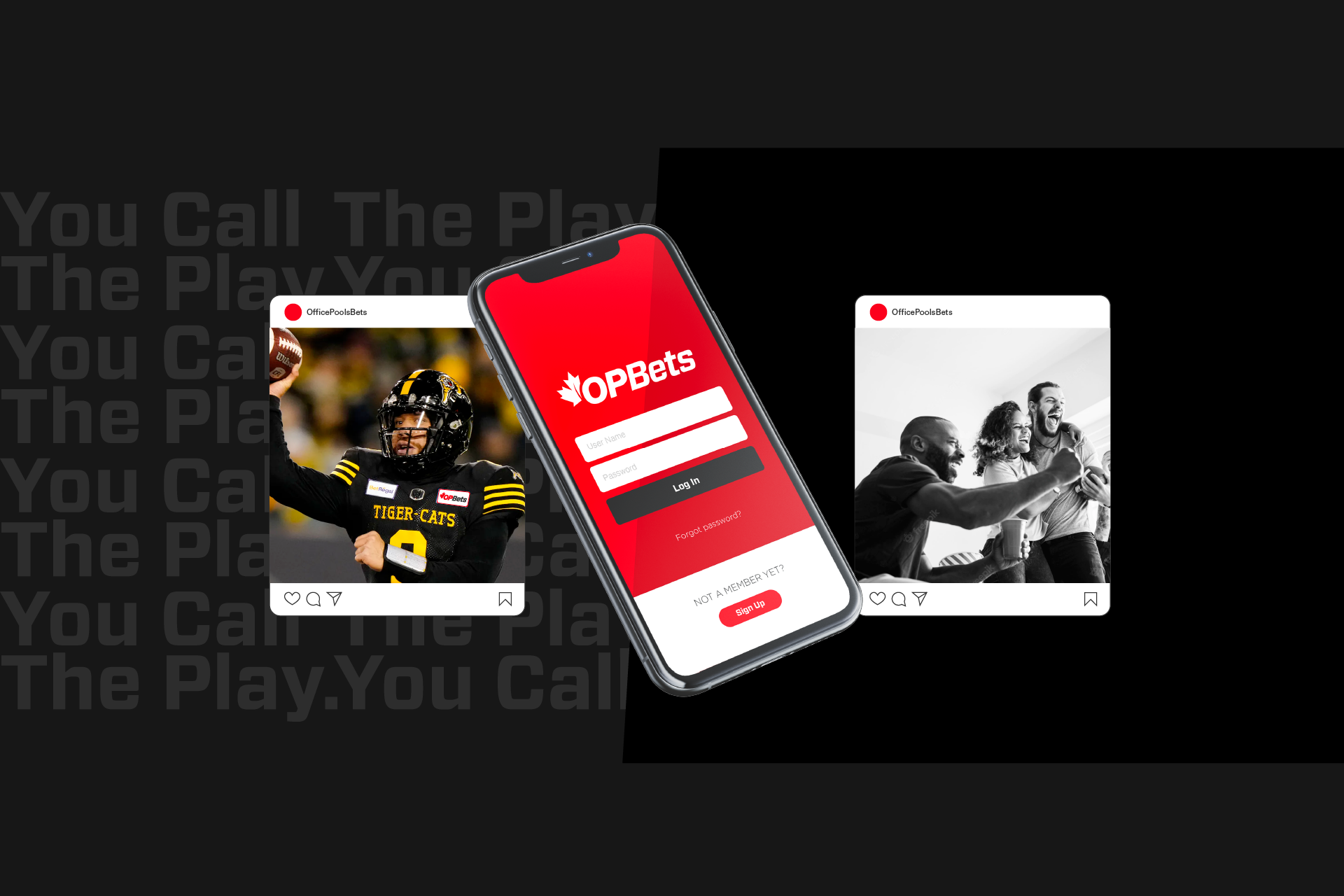
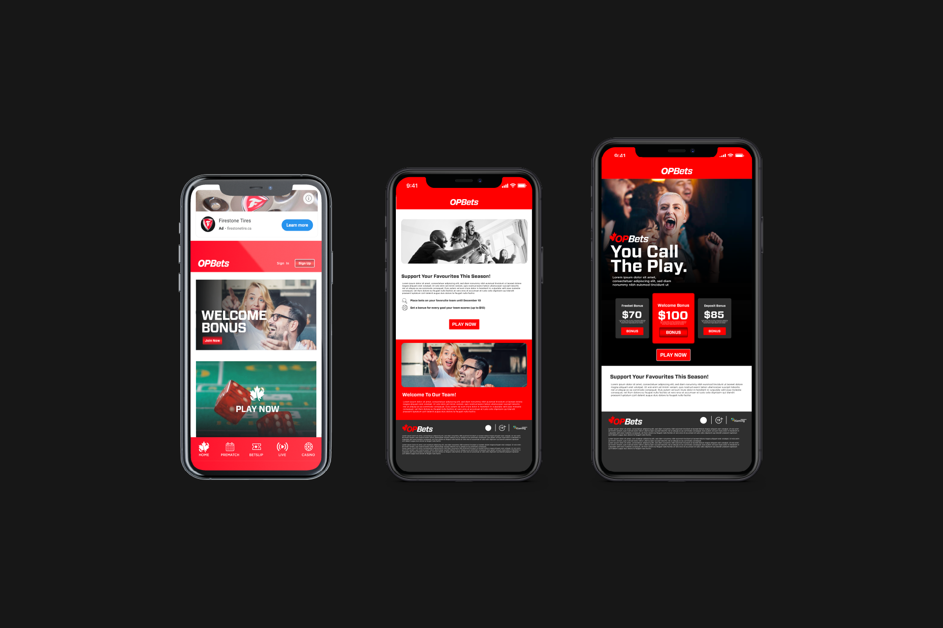
Regulatory Navigation Strategy: Addressed Ontario's linguistic restrictions prohibiting explicit"sports betting" terminology through creative language development, positioning OPBets with"You Call The Play" messaging and "play" terminology to replace "bet" across all communications.
Brand Continuity Framework: Leveraged Office Pools' 28-year brand equity through strategic visual evolution rather than complete rebrand, maintaining user trust while modernizing for competitive iGaming marketplace.
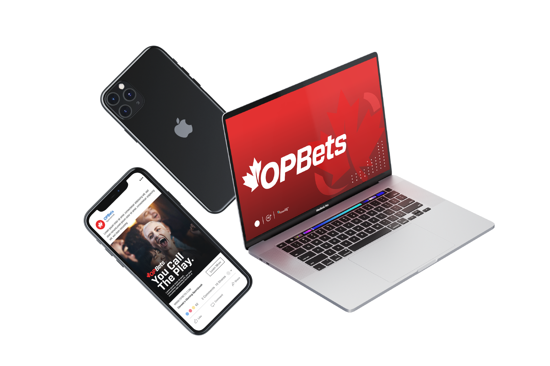
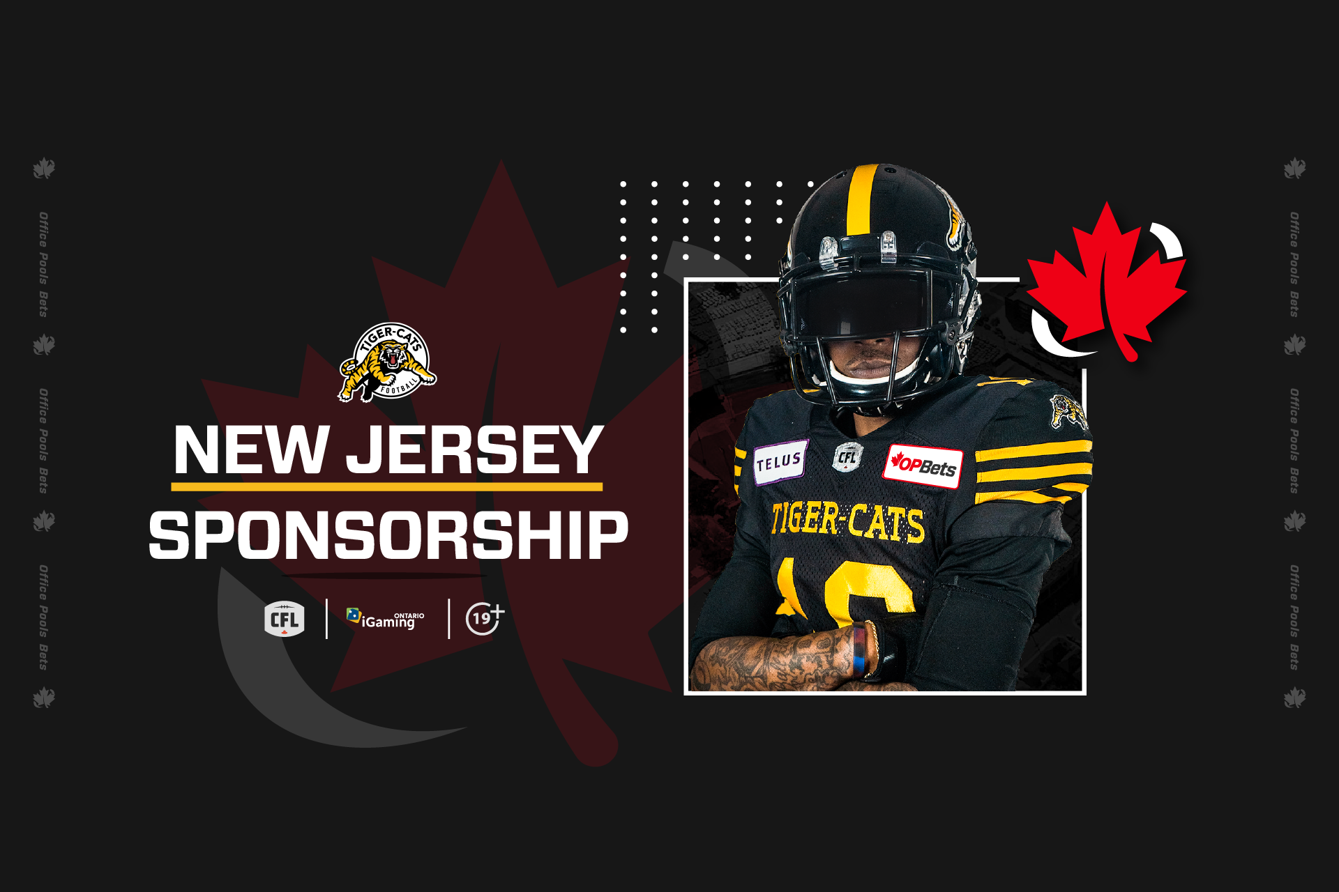
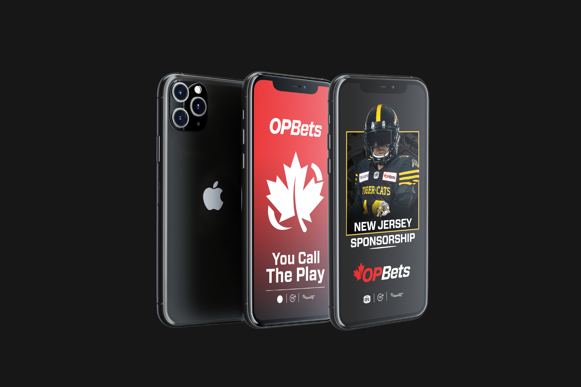
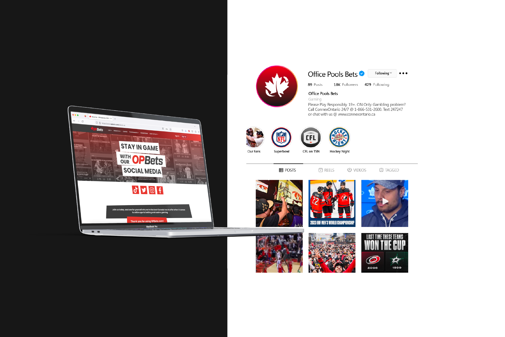
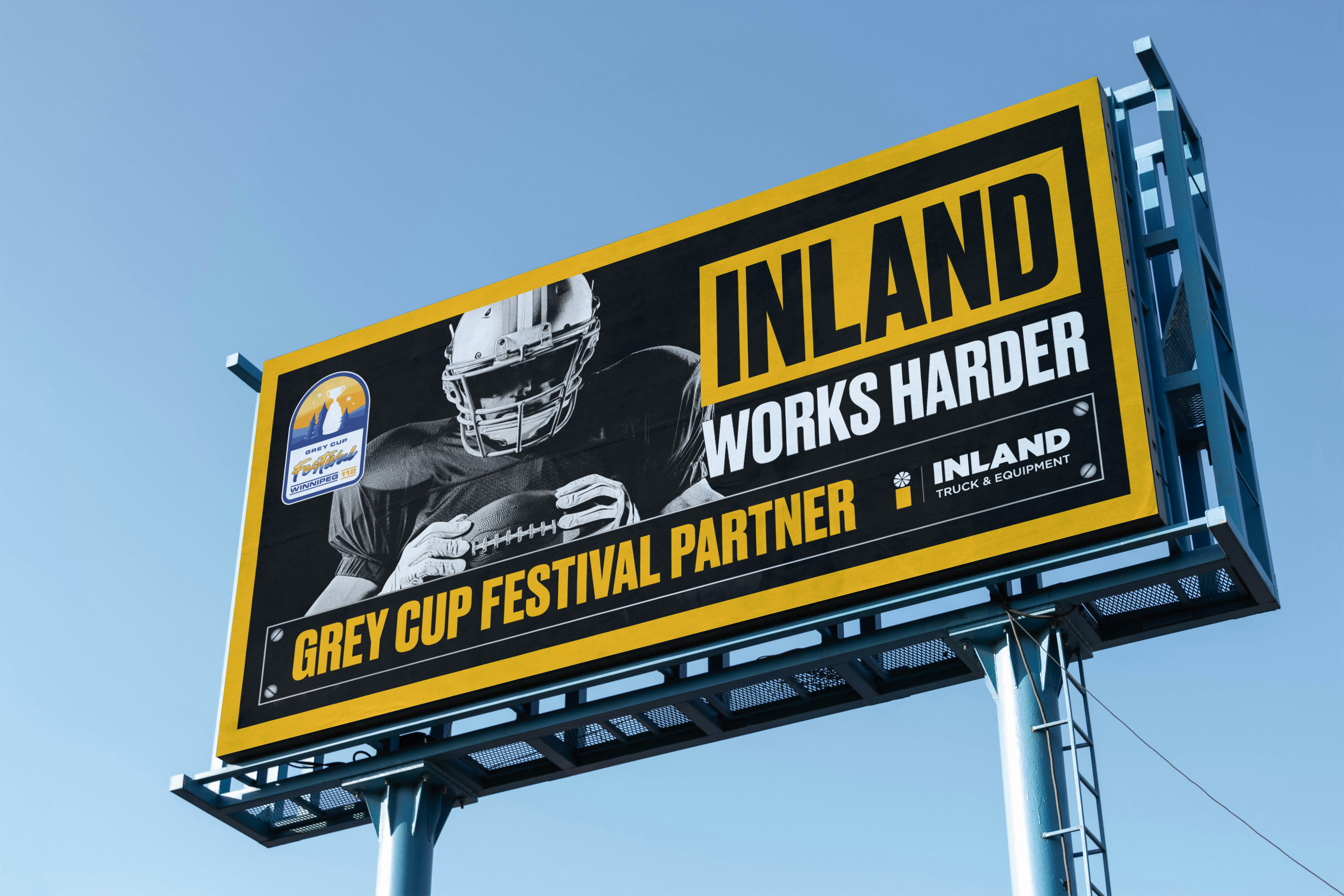
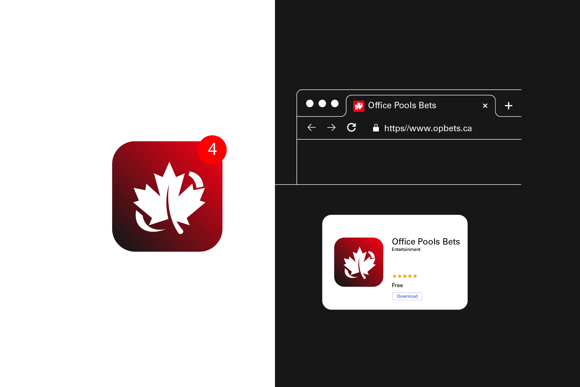
Visual Identity & Brand Architecture: Developed hybrid logo combining Office Pools' heritage Helvetica typeface ("OP") with modern sporty "Forza" typography ("Bets") in signature red. Integrated stylized Canadian maple leaf within community-focused oval symbol representing teamwork and giving back. Created "by Canadians, for Canadians" positioning with overtly patriotic visual language.
Comprehensive Brand Deliverables:
Market Differentiation Strategy: Positioned OPBets as the only Canadian-owned iGamingplatform in Ontario, emphasizing community investment through youth sports funding initiatives. Developed authentic Canadian brand personality balancing professional credibility with approachable, inclusive messaging to counter negative gambling stigma.
User Migration Framework: Created seamless transition experience for 500,000+ Office Pools users through gift card incentive programs, familiar design language, and simplified user experience prioritizing ease-of-use over complex betting options.